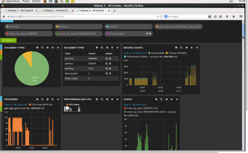
Kibana dashboards, from the Elasticsearch project, can help you visualise activity and incidents in log files. Here I show 3 different types of use cases for dashboards and how each can be used to answer different questions depending on the person. Video and details follow. Continue reading VIDEO: Kibana 3 Dashboard – 3 Use Cases Demonstrated
Category: Analytics
Kafka Consumer – Simple Python Script and Tips
[UPDATE: Check out the Kafka Web Console that allows you to manage topics and see traffic going through your topics – all in a browser!]
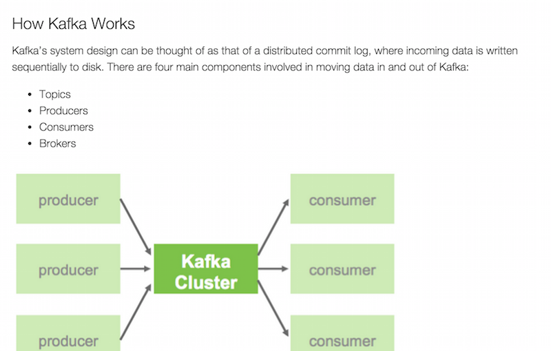
When you’re pushing data into a Kafka topic, it’s always helpful to monitor the traffic using a simple Kafka consumer script. Here’s a simple script I’ve been using that subscribes to a given topic and outputs the results. It depends on the kafka-python module and takes a single argument for the topic name. Modify the script to point to the right server IP.
from kafka import KafkaClient, SimpleConsumer
from sys import argv
kafka = KafkaClient("10.0.1.100:6667")
consumer = SimpleConsumer(kafka, "my-group", argv[1])
consumer.max_buffer_size=0
consumer.seek(0,2)
for message in consumer:
 print("OFFSET: "+str(message[0])+"\t MSG: "+str(message[1][3]))
Max Buffer Size
There are two lines I wanted to focus on in particular. The first is the “max_buffer_size” setting:
consumer.max_buffer_size=0
When subscribing to a topic with a high level of messages that have not been received before, the consumer/client can max out and fail. Setting an infinite buffer size (zero) allows it to take everything that is available.
If you kill and restart the script it will continue where it last left off, at the last offset that was received. This is pretty cool but in some environments it has some trouble, so I changed the default by adding another line.
Offset Out of Range Error
As I regularly kill the servers running Kafka and the producers feeding it (yes, just for fun), things sometimes go a bit crazy, not entirely sure why but I got the error:
kafka.common.OffsetOutOfRangeError: FetchResponse(topic='my_messages', partition=0, error=1, highwaterMark=-1, messages=)
To fix it I added the “seek” setting:
consumer.seek(0,2)
If you set it to (0,0) it will restart scanning from the first message. Setting it to (0,2) allows it to start from the most recent offset – so letting you tap back into the stream at the latest moment.
Removing this line forces it back to the context mentioned earlier, where it will pick up from the last message it previously received. But if/when that gets broke, then you’ll want to have a line like this to save the day.
For more about Kafka on Hadoop – see Hortonworks excellent overview page from which the screenshot above is taken.
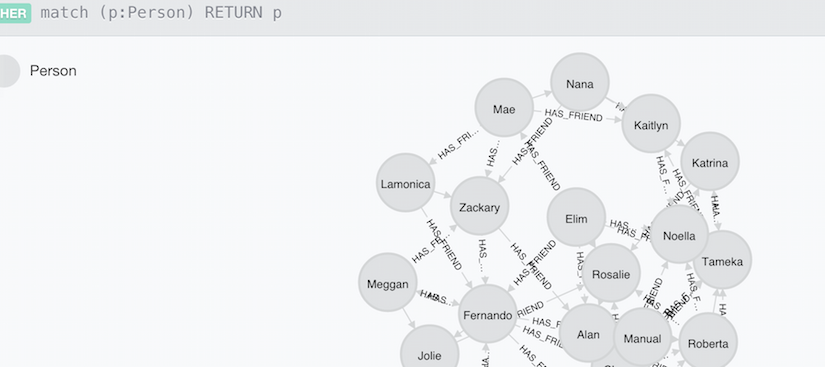
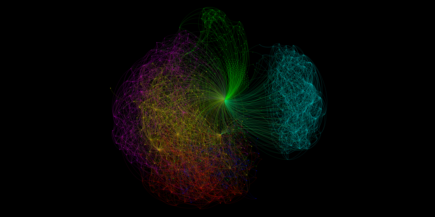
Neo4j Cypher Query for Graph Density Analysis
Graph analysis is all about finding relationships. In this post I show how to compute graph density (a ratio of how well connected relationships in a graph are) using a Cypher query with Neo4j. This is a follow up to the earlier post: SPARQL Query for Graph Density Analysis.
Installing Neo4j Graph Database
In this example we launch Neo4j and enter Cypher commands into the web console… Continue reading Neo4j Cypher Query for Graph Density Analysis
Code snippet: SPARQL Query Graph Density
Code snippet: SPARQL Query Graph Density
I’m testing out sharing SPARQL code snippets using Github Gist features. I’ll be adding more as I work through more graph-specific examples using SPARQLverse, but here is my first one:
Ideally we’d have a common landing place for building up a library of these kinds of examples.
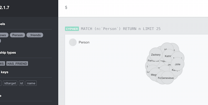
Graph relations in Neo4j – simple load example
In preparation for a post about doing graph analytics in Neo4j (paralleling SPARQLverse from this earlier post), I had to learn to load text/CSV data into Neo. This post just shows the steps I took to load nodes and then establish edges/relationships in the database.
My head hurt trying to find a simple example of loading the data I had used in my earlier example but this was because I was new to the Cypher language. I was getting really hung up on previewing the data in the Neo4j visualiser and finding that all my nodes had only ID numbers was really confusing me. I had thought it wasn’t loading my name properties or something when it was really just a visualisation setting (more on that another time). Anyway, enough distractions… Continue reading Graph relations in Neo4j – simple load example
Geospatial Power Tools Reviews [Book]
Thinking of buying my latest book? We’ve finally got a few reviews on Amazon that might help you decide. See my other post for more about the book. Buy the PDF on Locate Press.com.
Reader Reviews
January 24, 2015 By Leo Hsu
“The GDAL Toolkit is chuckful of ETL commandline tools for working with 100s of spatial (and not so spatial data sources). Sadly the GDAL website only provides the basic API command switches with very few examples to get a user going with. I was really excited when this book was announced and purchased as soon as it came out. This book makes a great reference manual for using GDAL/OGR suite of command line utilities.Several chapters are devoted to each commandline tool, explaining what its for, the switches it has, and several examples of how to use each one. You’ll learn how to work with both vector/(basic data no vector) data sources and how to convert from one vector format to another. You’ll also learn how to work with raster data and how to transform from one raster data source to another as well as various operations you can perform on these.”
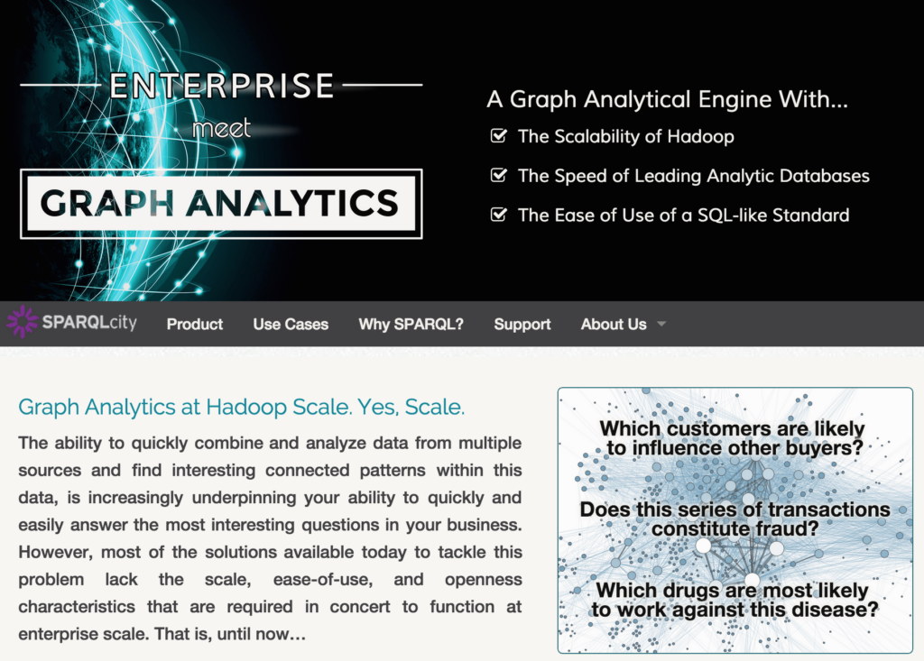
Graph analytics – the new super power
Graph analytics – is it just hype or is it technology that has come of age? Mike Hoskins, CTO of Actian sums it up well in this article from InfoWorld:

“One area where graph analytics particularly earns its stripes is in data discovery. While most of the discussion around big data has centered on how to answer a particular question or achieve a specific outcome, graph analytics enables us, in many cases, to discover the “unknown unknowns” — to see patterns in the data when we don’t know the right question to ask in the first place.”
Read Mike’s full article at:

In the remainder of this post I outline a few more of my thoughts on this topic and give you pointers to some more resources to help you understand what to do next.
SPARQL Query for Graph Density Analysis
I’ve been spending a lot of time this past year running queries against the open source SPARQLverse graph analytic engine. It’s amazing how simple some queries can look and yet how much work is being done behind the scenes.
My current project requires building up a set of query examples that allow typical kinds of graph/network analytics – starting with the kinds of queries needed for Social Network Analysis (SNA), i.e. find friends of friends, graph density and more.
In this post I go through computing graph density in detail. Continue reading SPARQL Query for Graph Density Analysis
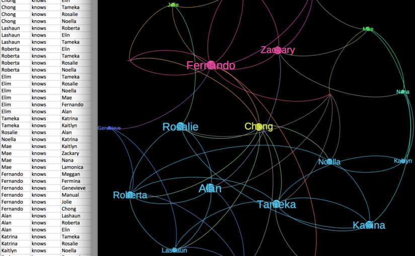
Social Graph – Year in Review (Preparation)
I pulled this visualization of my LinkedIn social graph together in just a few minutes while working through a tutorial. What about other social networks? Give me your input… Continue reading Social Graph – Year in Review (Preparation)
Data Sharing Saved My Life – or How an Insurer Reduced My Healthcare Claim Costs
It’s not every day that you receive snail mail with life-changing information in it, but when it does come, it can come from the unlikeliest sources.
A year ago, when doing a simple change of health insurance vendors, I had to give the requisite blood sample. I knew the drill… nurse comes to the house, takes blood, a month later I get new insurance documents in the mail.
But this time the package included something new: the results of my tests.
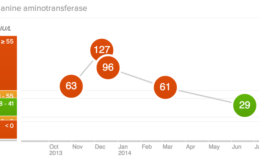
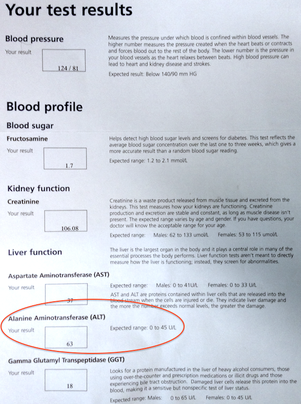
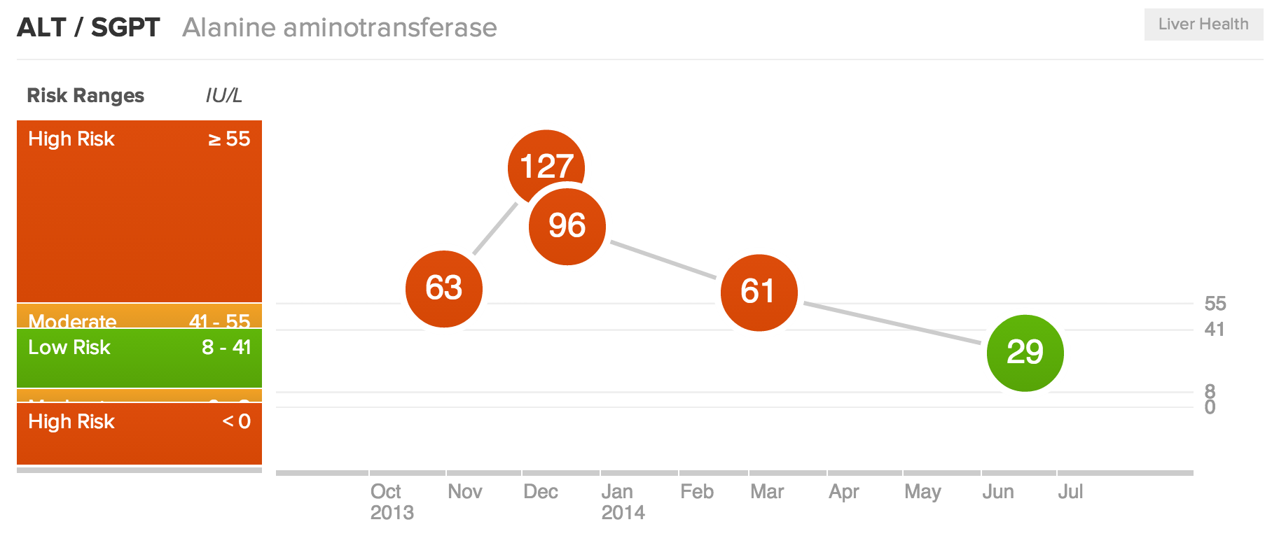
The report was a list of 13 metrics and their values, including a brief description about what they meant and what my scores should be. One in particular was out of the norm. My ALT score, which helps measure liver malfunction, was about 50% higher than the expected range.
Simple Data Can Be Valuable
Here is the key point: I then followed up with my family doctor, with data in hand. I did not have to wait to see symptoms of a systemic issue and get him to figure it out. We had a number, right there, in black and white. Something was wrong.
Naturally, I had a follow up test to see if it was just a blip. However, my second test showed even worse results, twice as high in fact! This lead to an ultrasound and more follow up tests.
In the end, I had (non-alcoholic) Fatty Liver Disease. Most commonly seen in alcoholics, it was a surprise as I don’t drink. It was solely due to my diet and the weight I had put on over several years.
It was a breaking point for my system and the data was a big red flag calling me to change before it was too late.
Not impressed with my weight nor all my other scores, I made simple but dramatic changes to improve my health.* Changes were so dramatic that my healthcare provider was very curious about my methods.
By only making changes to my diet I was able to get my numbers to a healthy level in just a few months. In the process I lost 46 pounds in 8 months and recovered from various other symptoms. The pending train wreck is over.
Long Term Value in Sharing Healthcare Data
It’s been one year this week, so I’m celebrating and it is thanks to Manulife or whoever does their lab tests, for taking the initiative to send me my lab results.
It doesn’t take long to see the business value in doing so, does it? I took action on the information and now I’m healthier than I have been in almost 20 years. I have fewer health issues, will use their systems less, will cost them less money, etc.
Ideally it benefits the group plan I’m in too as a lower cost user of the system. I hope both insurers and employers take this to heart and follow suit to give the data their people need to make life changing and cost reducing decisions like this.
One final thought.. how many people are taking these tests right now? Just imagine what you could do with a bit of data analysis of their results. Taking these types of test results, companies could be making health predictions for their customers and health professionals to review. That’s why I’m jumping onto “biohacking” sites like WellnessFX.com to track all my scores these days and to get expert advice on next steps or access to additional services.
I’m so happy with any data sharing, but why give me just the raw data when I still have to interpret it? I took some initiative to act on the results, but what if I had needed more incentive? If I had been told “Lower your ALT or your premiums will be 5% higher” I would have appreciated that.
What’s your price? If your doctor or insurer said “do this and save $100” – would you do it? What if they laid the data out before you and showed you where your quality of life was headed, would it make a difference to you?
I’m glad I had this opportunity to improve my health, but at this point I just say thanks for the data … and pass the salad please!
Tyler
* I transitioned to a Whole Food – Plant Based diet (read Eat to Live and The China Study). You can read more about the massive amounts of nutrition science coming out every year at NutritionFacts.org or read research papers yourself.