(Okay, so you can be up and running quicker if you have a better internet connection than me.)
Want to get your hands dirty with Hadoop related technologies but don’t have time to waste? I’ve spent way too much time trying to get HBase, for example, running on my Macbook with Brew and wish I had just tried this Virtualbox approach before.
In this short post I show how easy it was for me to get an NFS share mounted on OSX – so I could transparently and simply copy files on HDFS without needing any special tools. Here are the details… Continue reading From zero to HDFS in 60 min.
Need to “Perform Big Data Analytics at Massive Scale?” The Actian Analytics Platform includes the Matrix high performance analytics database (formerly known as Paraccel).
I’ve seen some people asking online for what JDBC URL syntax is. If you are using the JDBC driver be sure to read the README which gives the details:
The driver recognises JDBC URLs of the form: jdbc:paraccel:database
jdbc:paraccel://host/database
jdbc:paraccel://host:port/database

Also, you can supply both username and passwords as arguments, by appending them to the URL. For example:
jdbc:paraccel:database?user=me
jdbc:paraccel:database?user=me&password=mypass

Notes:
1) If you are connecting to localhost or 127.0.0.1, you can leave the host out of the URL; that is, jdbc:paraccel://localhost/mydb can be replaced with jdbc:paraccel:mydb
2) The port defaults to 5439 if it is not specified.
I spent the last 6 months undergoing some dramatic health changes (ping me for details), primarily diet, and now I’m getting around to refactoring my fitness. Naturally, I want to try some apps that both collect lots of sensor data but that also present it back to me in a meaningful (and hopefully motivating) way.
While I’m not sure that I’d classify all the sensor data from my iPhone as a “big data” stream, it has some common attributes – in particular, that I want to keep it all and it will grow endlessly and never stop (to quote Actian’sCTO). So as I’m moving around, walking, running and more, I want to capture that. Then I want to use whatever tools I want to process, analyse and visualise it.
If you’re already into fitness than you’ve already hear about the myriad of devices waiting on store shelves for you to pick up – from pedometers to bathroom scales – and strap to your persons. Internet of Things anyone? It’s not your fridge measuring energy and toaster monitoring temperature – it’s your wrist band monitoring your every footstep and your phone correlating it with your location, time of day and weather.
What a great time to be alive for a data junkie working in analytics and visualisation!
A Few Apps
So let’s talk devices, apps and services…
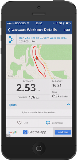
MapMyFitness app on iPhone 5
One of the most popular ones I hear about is MapMyFitness. You can read lots about it elsewhere. I used it to track some walks and runs, but mainly to share with a friend who does the same (keeping an eye on the competition!). I’ve used it on and off for a few years to keep track of walks and gym visits. I only used it on my iPhone and found GPS mapping was really good. I particularly like the elevation gain stats and the ability to select from past routes.
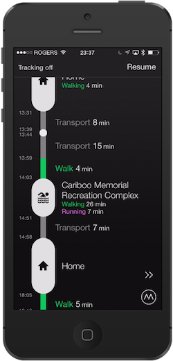
Moves app on iPhone 5.
I briefly tried another app called Moves and it had a really interesting interface and visualiser. All computed as automatically as possible, guesstimating where you are at (Home vs Gym) and what you are doing. It’s neat, I might try it again someday now that I’m actually doing more than just driving around.
I see there are lots of other online services and apps that can read from or populate both these apps. Do you see how the line between data, application and services continues to blur. Just as the “open data” revolution has rocked governments we’ll see “open monitoring” apps rock our personal lives. Or at least thats what I’m experiencing.
When (re)starting my fitness programme I had to decide what to do and what to stick with. My main goal was to track general movement, but also to get good stats and motivation while walking or running. Since I’d already used some of these other services, I figured it wouldn’t hurt to go with something else. Plus, getting a gift for a birthday always helps 🙂
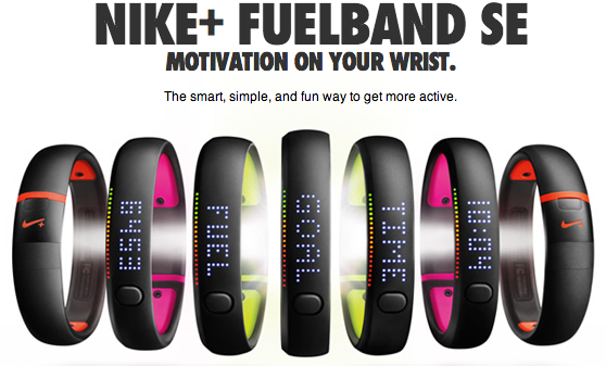
Nike+ Fuelband
So I went with the Nike+ Fuelband and have found it very useful.
Nike+ Fuelband activity tracker
In a nutshell, I’ve found that it:
Is unobtrusive
Fits comfortable (adjustable too)
Uses barely any power
Syncs constantly even during a workout
Doubles as a watch
Comes with some interesting apps – on phone, in browser and feedback on the band itself
I wasn’t familiar with NIKEFUEL – a single unit measurement that sums up all your activity. It’s handy because you can compare your FUEL numbers with someone else on equal footing. It roughly converts to calories but is more of a sum-total picture.
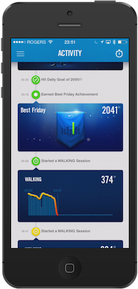
Nike+ Fuelband App on iPhone 5
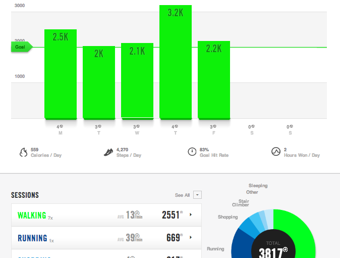
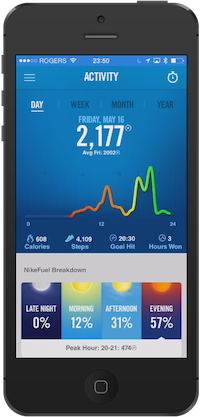
The Phone App
On the phone I fire up the Fuelband app and it syncs with the band and updates all my stats. The basic stats screen shows how close I am to my FUEL points for the day, while changing the colour of items to also bring the point home that I’m aiming for “green”. Other screens show how I’m doing by the week, month and year.
It’s all about goals. I’ve found it recommended a good starting goal (which is still pushing me beyond what I was doing before this). And it also recommended adding additional goals when I saw that I was starting to run (i.e. Try running 3x per week).
Nike+ Fuelband app on iPhone 5 – activity stats and motivations
They also have various motivations throughout the app – “awards” and comparisons with others in my age bracket during the same time of day. I’m really impressed with how they’ve leverage crowdsourced stats, while also keeping them anonymised yet useful for me.
I’ll show you how to can access that raw data in another post – but for now, enjoy the screenshots of their apps, knowing you can also build your own!
For most of the first week I only used the phone app and the band directly. By clicking the single button on the band it displays time and daily stats: fuel, steps, hours won (hours in which you were moderately active for 5 minutes) and calories. It has a great little coloured indicator that also changes as you reach toward “green”. This kind of feedback completes the full circle of – monitor, analyse and act – what so much of big data analytics aims to do.. but I digress…
Nike+ Fuelband – goal status indicators
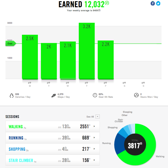
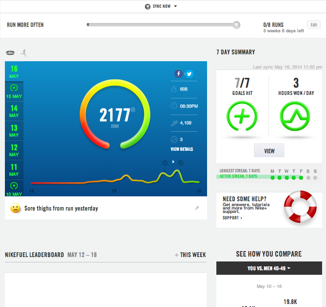
Web Apps
But the device and the mobile app are only part of the package. By creating a Nike+ account you get access to all your Fuelband app data (and the Nike+ Running App data if you are using it. More on that another time I think.)
The site includes a daily dashboard view, which is excellent – providing a good mix of high level goal achievement with meaningful visuals and links to more summarised weekly or monthly info logs. This is a very useful free service and could be worth the price of a device in and of itself.
Up Next
Aside from using the Fuelband app, you can also use the Nike+ Running app, along with the Nike+ site, which uses your iPhone to collect everything. More on that in another post. I’ll also give an intro to using Nike+ developer API to get access to my data!
Though it’s been years since I attended a FOSS4G event, it’s getting temptingly closer to home (geographically speaking). I know several good folks down in Portland and Oregon, so can rest assured that recommending you to check it out is a safe bet. I’m sure it will be an all-you-can-eat smorg of geospatial software goodness!
If I needed QGIS beginner or advanced training, I’d try to take it from the founder of QGIS. Gary Sherman is advertising his 2014 courses on GeoApt.net:
Training from GeoApt LLC
We are currently organizing courses for the upcoming year:
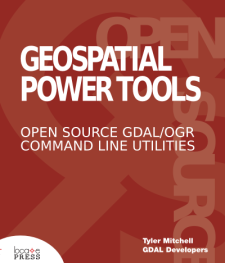
It’s a 310 page collection of all the GDAL/OGR command utility documentation, written by the GDAL Developers. Included are also about 100 pages of new content that shows more examples of how to use the various commands to do specific tasks. This will help those who may not know what command to use, but who know what task they want to do – i.e. convert an image, mosaic images, query a WFS, etc.
From discussions I had over the past few years, it seemed many people needed this book or knew a colleague who could use it. I know when I worked in forestry GIS and used these tools it was exciting, but my colleagues didn’t know about them and there wasn’t much available to help fill that gap. I hope this book effort does help.
This is a PDF version so far, but expect a Kindle and paperback version around the end of the year!
20% off sale this weekend
coupon code “firstlook”!
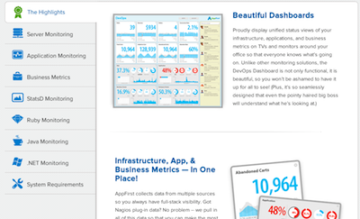
I came across a couple interesting packages recently for both system and app monitoring scenarios.
AppFirst
Their “Beautiful Dashboards” slogan says it all – they have a free version of their DevOps Dashboard system for monitoring up to 3 servers. Among lots of cool stuff, I especially like how they show historic ranges in the background of charts, and flag anomalies visibly.
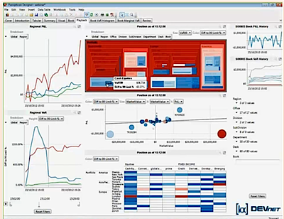
DataWatch / Panopticon
I met some of the DataWatch team at the recent Data Viz Summit and was impressed with their tutorial on using their dashboard building tools. It all looked good and was easy to build and use – also the ability to drill-down was quite powerful as was their ability to attach to streams and perform playback.
First, it’s the day that Locate Press’s second title is now starting to become available through Amazon! There are several titles in the works but this one made it past the post first.
This relates also to my second item… I’ve stepped back from Locate Press over the past month to hand the leadership over to Gary Sherman. This is really good news for all our readers and future authors, because he will have more time than I did to keep things moving forward.
Personally, my day job is demanding enough for me at the moment and I knew it wasn’t going to get any easier, so finding a replacement to take over the company was a no-brainer. Gary’s been involved with Locate Press from the very beginning and knows the toolchain, editorial processes and publishing paradigm just as well as I ever did. In fact, he single handedly put the QGIS Training Manual into production, which was inspiring to watch from the sidelines.
I’m still around and helping where needed, but am focused on my continuing work with Actian Corp which is growing and innovating in some interesting ways – it’s a great company to being working with and I’ll share more as things progress there.
By the way, with this transition, it’s a great time to pitch your new geospatial book ideas to Gary – drop him a note!
Thanks for all the support I received when launching Locate Press!!
“Jack into the ‘net -make an impact and realise your full potential!”
Taken from future advert for the first Matrix implant computing system.
By metacortex on redbubble.com
Don’t sign me up…
I really enjoy technology that allows me to do work from a remote home office, but outside of work unless the technology enables face-to-face time and with people geographically near to me then my time may be best spent elsewhere. Having children helps keep it real for me. My filter operates on the premise that unless something I’m doing online is going to benefit my work/career, my family, my community, or teach me something useful within those spheres – then it’s not high priority.
Stay with me, this isn’t just a rant about disconnectness or a deadbeat Internet obsessed parent! This potentially applies to you, your business network and how you come up with new ideas.
Social apps leave me cold. I guess if they’re called social apps I can’t fault them for focusing on solving social “problems” such as “How to find your friends on Friday night!” or answering important life questions like “should I eat here?” Now we’re able to find “deals” locally and much much more with all this hyperlocal app mumbo jumbo. But how did we ever survive without these precious tools? I dare say we had to talk with friends, family and neighbours to get recommendations or phone them to ask what they’re up to next week.
All the work-related benefits of Internet/social apps/LBS technology aside, consider how information technology can easily push us toward isolation from others around us. On the surface it doesn’t seem to be a bad thing – with 10 minutes noticed I can hang out online with more geo-geeks than I can ever muster up within a 400km radius from my home office. Seriously.
But when it comes to connecting with my neighbour, our city council or even local businesses, it’s a complete and utter fail. Granted, I don’t live in the largest municipality, but the impact is similar in large centres too. You can occasionally find some new local shop or service you didn’t know was just around the corner, but more often than not you find one that is across town or out of town instead. As we travel to these non-local sites we continue the isolation from our “real” local communities and local business networks.
If the technology is helping isolate us, how do we bring it back around? Egads! It gets kinda messy to be liberated from this Matrix machine sometimes, but there are some time-tested models for rehabilitation that you might consider. Here are two…
In a previous post (Open Gov/Data Needs Collaborative Common Spaces) – I proposed that we need to get data providers into the same rooms as those who are users or, better yet, those who best add value to the data. Rubbing shoulders, face-to-face, sharing problems and solutions across domains and disciplines is key. We don’t always know what the outcome will be, but the more isolated these stakeholders and providers are, the more insular the outcome. Guaranteed. I was pointing to the co-working model as one way to help make that happen – though enabling public servants to hang out in more accessible locations may be the largest barrier to that idea!
Steven Johnson touches on a similar vein in his talk on where good ideas come from. Hint: it’s not from reviewing the results of a multi-year stakeholder survey. Nor is it from mining mailing lists or user groups dedicated to a particular topic. His conclusion is similar to mine, using the coffee house as an example of the kind of unstructured communication that leads to breakthroughs. Now we are way beyond metaphors here, we’re talking real, meaningful and messy ways of bringing people together to serendipitously meet, chat and share. That could be around the boardroom table once a week when you bring in disparate team members, but even better if you can be rubbing shoulders with others in a non-exclusive environment.
What does that look like?
I have some vague ideas – co-working space, coffee shop, impromptu customer visits, hackfests, heck even the water cooler! – but I think we’re still early in defining what these look like and how to best engage at a more meaningful level. Ironically, I do believe that much of the answer lies in (pre-Internet era) history, so asking relatives that are not as online connected may reveal some interesting results.
However, I do believe that the first step in truly coming to grips with the reality of techno-fueled isolation is to admit there is a need to “bring ourselves back together” in a meaningful way. It’s early days, but mark my words we’ll have a whole industry devoted to helping people get “unplugged” and we’ll see friends and colleagues disappear from online while they reclaim their local relationships. I don’t think it needs to be that dramatic but is worthy of some consideration to find an effective balance and to check that our pulses are not timed with our router packet traffic.
We’ll know there has been progress when hyperlocal starts to refer to relationships between people and not our relationship with applied technology. Likewise, we could benefit by reclaiming the definition of communication as a conversation between two people. And the time is now, not after Skynet becomes sentient or the Matrix materialises… without our knowing.

 The site includes a daily dashboard view, which is excellent – providing a good mix of high level goal achievement with meaningful visuals and links to more summarised weekly or monthly info logs. This is a very useful free service and could be worth the price of a device in and of itself.