A couple years ago you may have read this great post from boredpanda talking about a research paper that took deep learning algorithms and applied them to art. This opened up the possibility of, say, taking a photo and having it re-imagined as being a painting from an old master.
It’s actually pretty easy to do this now using a site called deepdreamgenerator.com. I’ve done quite a few experiments on the site using a variety of images from the web and found it pretty fun.
I’ve also started to download some of the deep learning toolkits (e.g. Berkely Caffee) that are available, hopefully I can do higher resolution work with these in the future.
But for you today I thought I’d take a basic QGIS map using Natural Earth dataset and have it “re-cartofied” as Mercator – and show you how I did it.
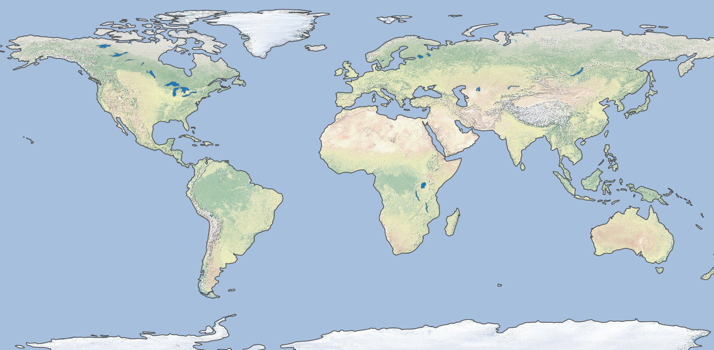
Step 1 – Make a world map with QGIS
Using the awesome data from the Natural Earth website I put together a very simple world map.
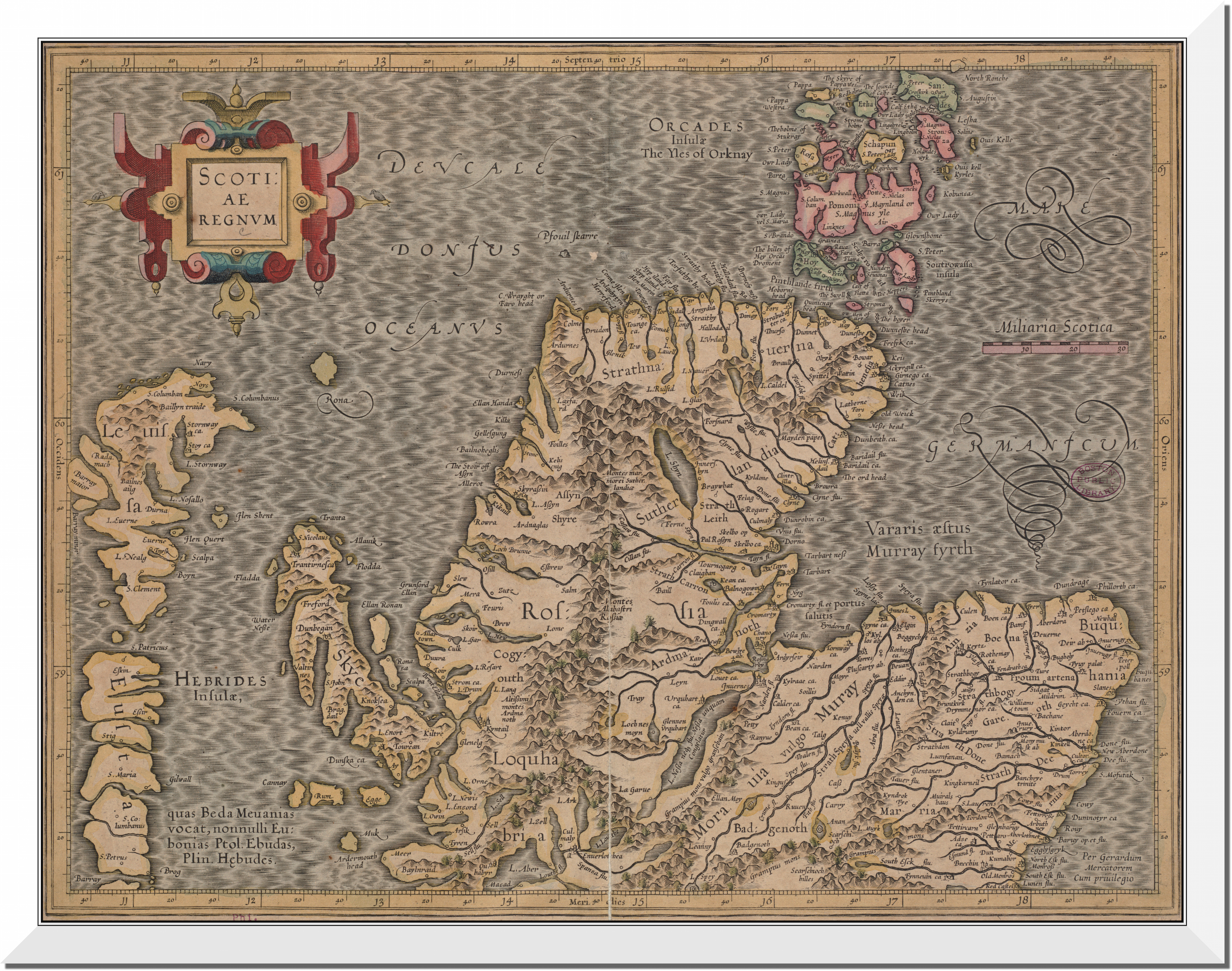
Step 2 – Grab an old map
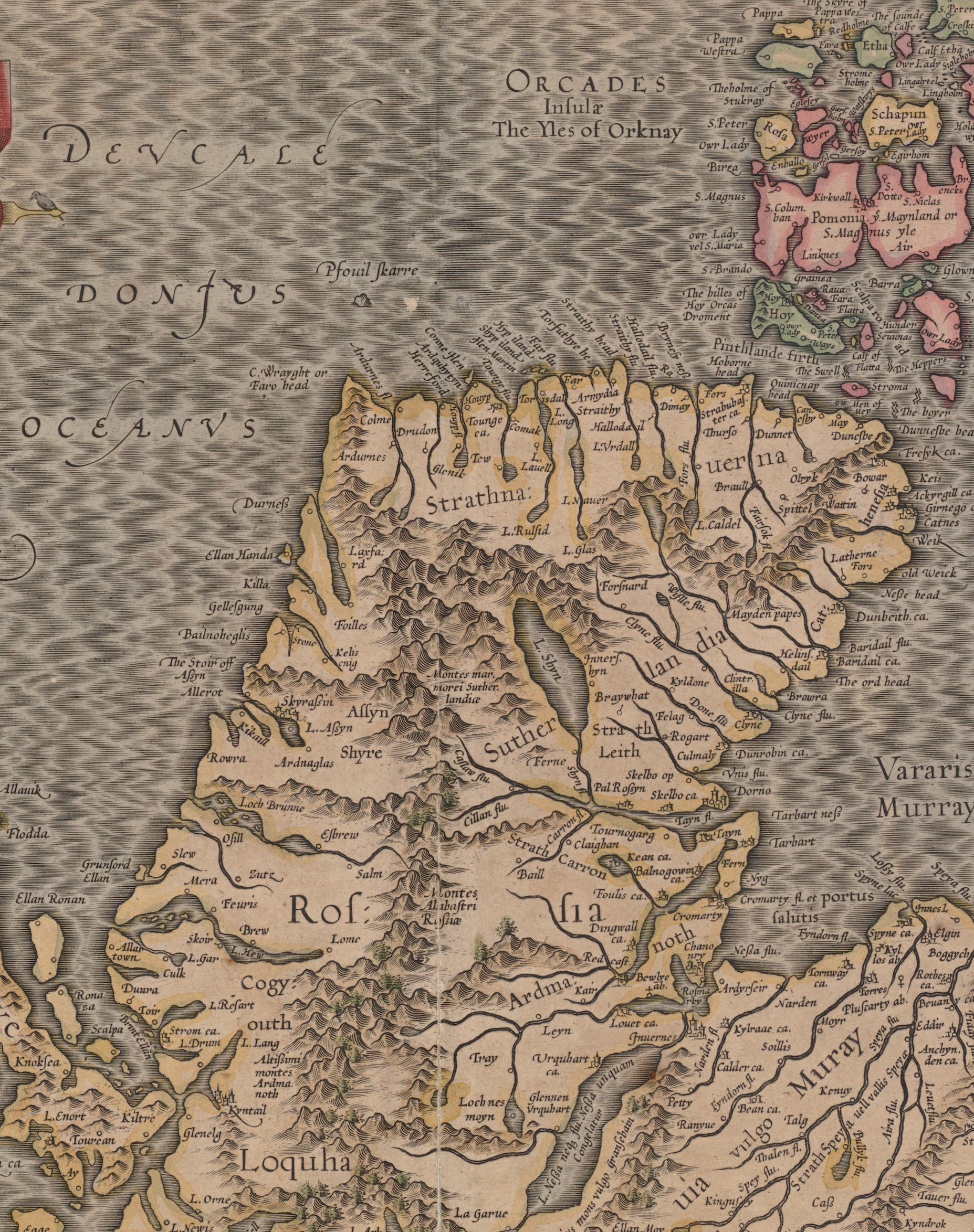
The way this deep “dream” imaging site works is that it can use a second image as, what they call, a style. So I first just grabbed a basic Mercator map of Scotland. Lots are available on David Rumsey’s awesome map library site!
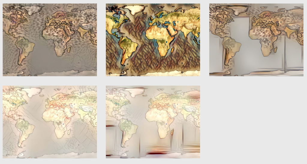
At first I used the full basic image without any processing, but it produced weird artifacts – lines, etc. in the resulting map. Here are a few of my test images. If you select them from this page you can see the input/source images.
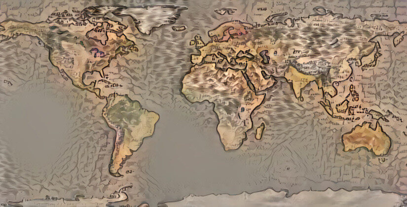
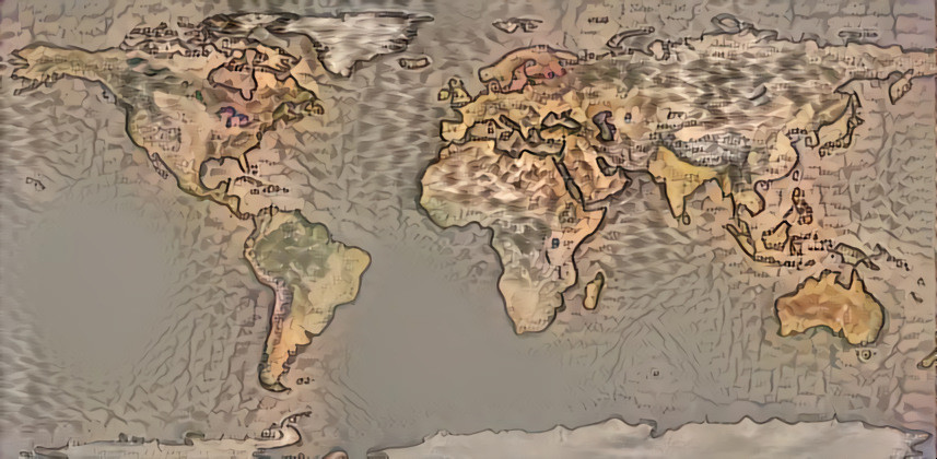
Step 3 – Deep Learning Cartography Magic – Voila!
The final version of my map turned out good enough, though there are several more settings I could tweak. Note, those are not compression artifacts – they are mountains! Yes, in the ocean 🙂
Tips…
To get this far I had to also crop the Mercator source map to remove page borders, legend, surrounding text, etc. This helped reduce the set of input style items to things like mountains, water, and of course CASTLES! 🙂 Here is the image I used for styling.
I hope you found this interesting, if you make something similar please share it with on Twitter/1tylermitchell.